Thinking accessibility while choosing charting libraries
Frontend Developer at Thoughtworks
While choosing a charting library we can think of the following parameters to improve the overall accessibility -
Colour contrast ratio
Arial labels / Title / Label/ Description
Simpler charts or tables
Providing text summary of complex charts
Ease of interacting with data elements
Prefer prefers-reduced-motion css media feature
Responsive design
**1. Colour contrast ratio **
Contrast ratio is a term that’s used to measure the difference between the maximum and minimum brightness of a display. In simple terms the better the ratio the easier it is to differentiate those colours.
Depending on the accessibility level you can choose contrasting colours for the chart elements. There are several tools available to check the CCR ratio.
for e.g. https://contrast-ratio.com
**2. Aria Labels, Title, Label, Description **
Prefer adding meaningful Arial tags/title/labels/description to the elements which is necessary to be read by the screen reader. you can check if the elements are being correctly read by using the following screen readers - JAWS, Voice Over(IOS), NVDA
3. Simpler charts or tables
There will be scenarios where you might have to choose between charts. In such situations always prefer simpler charts with fewer UI elements. for simpler datasets preferably go for data tables.
4. Providing text summary for complex charts
If it is extremely necessary to have a complex chart then in such scenarios always provide a gist of the value provided by the chart either as a label or description. Nowadays most charting libraries allow developers to add labels and descriptions to the data elements as well.
For example, in chart.js you can provide arial-label, and role.
<canvas id="goodCanvas1" width="400" height="100" aria-label="Hello ARIA World" role="img"></canvas>
5. Ease of interacting with data elements
In a web application, the ease of navigating through the UI elements using the keyboard is quite an important factor for accessibility. Similarly in charts, the user should be able to navigate through the chart elements using the keyboard.
To understand this better let's check the type of charting libraries available -
SVG-based - creates DOM elements for charts which are focusable by keyboard with modification like adding tab-index. Although adding tab-index at runtime is difficult and tedious. so preferably go for a library like Highcharts or amCharts which has out-of-the-box support to add focusable elements.
Canvas-based - uses Canvas API to draw chart elements. so keyboard navigation will be difficult but there are a few libraries like amChart version 5 which allow keyboard navigation to predefined focusable elements.
6. Prefer prefers-reduced-motion css media feature
The prefers-reduced-motion CSS media feature is used to detect if the user has requested that the system minimize the amount of non-essential motion it uses.
Animations on charts may be a distraction for some specially-abled users, so it's always good to use this media feature to remove or reduce the animations on charts.
7. Responsive design
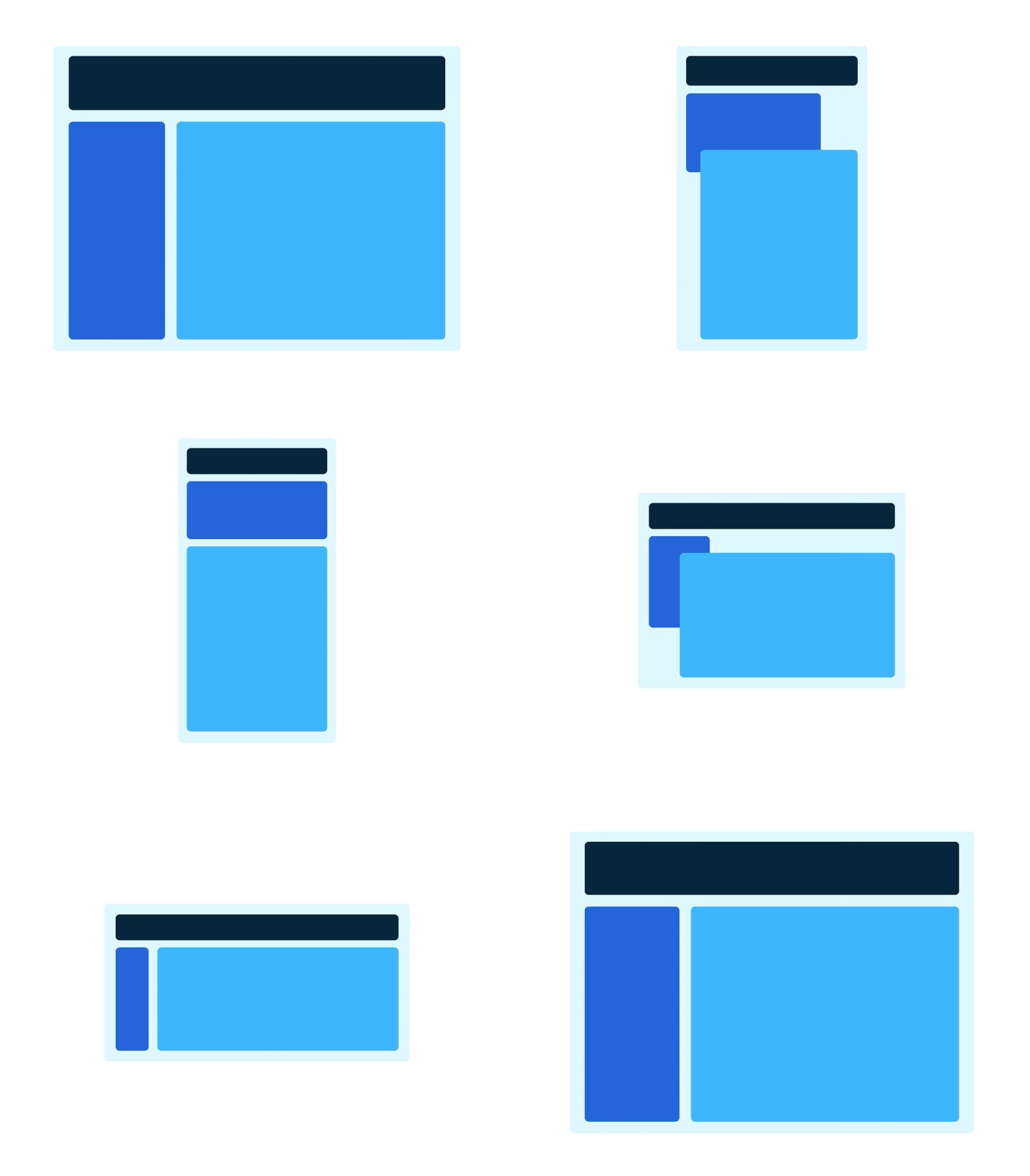
Keeping the charts responsive will help the user gain the same value on any device. Most libraries these days support responsive design.
Libraries
Following are the few popular charting libraries available which have good to basic support for accessibility -
SVG-based, Paid, Good accessibility support is available
version 4- SVG based, Paid, Good accessibility support available
version 5 - Canvas based, Paid, Good accessibility support available
Canvas-based, free, Very Basic accessibility support is available
SVG based, free, No out of the box support for accessibility but possible to improve by adding labels and having a good CCR ratio. click this to know more.
Feel free to comment if any feedback or concerns. Thanks !


